


The CSS Grid Layout Module helps design the layout more easily and consistently across browsers with a grid-based layout system. Grids come in handy in many situations like creating a price/ product card, creating the page layout, testimony section, avatar and many more places.
To start, we need to create a grid container that will serve as the parent element of all the children inside that will serve as grid items.
Then we need to change the CSS display property of the grid container. Now there are two types of displays for the grid which will not incur any changes to the flow of children/items inside the container.
inline-grid
grid
The Grid will make no changes to the natural flow of elements. Whereas display: inline-grid is used to make block-level grid container display inline.
<div class="gridContainer">
    <div class="grid1">1</div>
    <div class="grid2">2</div>
    <div class="grid3">3</div>
    <div class="grid1">4</div>
    <div class="grid5">5</div>
    <div class="grid6">6</div>
</div>
To define the area of each grid there are two properties that we can make use of.
grid-template-rowsfor row track.grid-template-columnsfor column track.
Row track
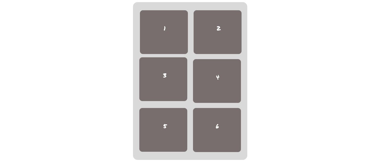
To define the row track we have to make use of Grid template rows on the grid container as follows -
.gridContainer{
    grid-template-rows: 100px 100px 100px;
}
The area gets applied to each of the grid items in all rows as the flow goes in the HTML. So if we don't provide any value for an item then the area fits the content inside that individual grid and the same applies to the grid template column. Different area units that can be used are px, fr, %, em and rem. The fr - fraction is a grid-specific unit only whose 1fr is for 1 part of the available space.
Output -

Column track
Grid-template-columns will define the column track. And this is how we make use of it.
.gridContainer{
    grid-template-columns: 100px 100px;
}
Output -
Repeat()
same results can be achieved with repeat() like this -
.gridContainer{
    grid-template-columns: repeat(2, 100px);
}
Repeat comes in handy when we want to define tracks with the same values like
which will give the same output as the above.
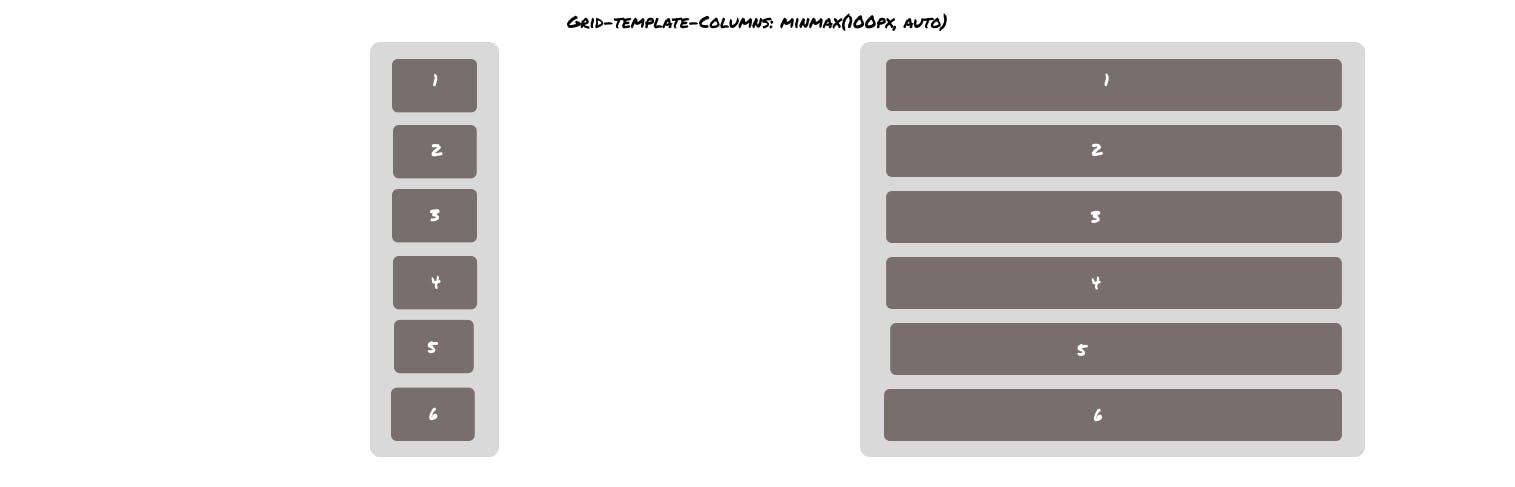
Minimum and maximum (minmax())
Minmax accepts two arguments: the first one is for minimum value and the second one is for maximum value. Minmax allows us to define the area of grids dynamically.
In this example, the first-row track is set to have a minimum height of 100px, but its maximum size of auto will allow the column track to grow if the content is wider than 100px.
.gridcontainer{
    grid-template-columns: minmax(100px , auto);
}
Output-
Grid area
grid-area is shorthand for grid-row-start, grid-column-start, grid-row-end and grid-column-end. And it looks like the following -
.grid1{
    grid-area: 1/ 1/ 2/ 3;
}
Which gives the same output as we saw in the grid-column: span 2; example.
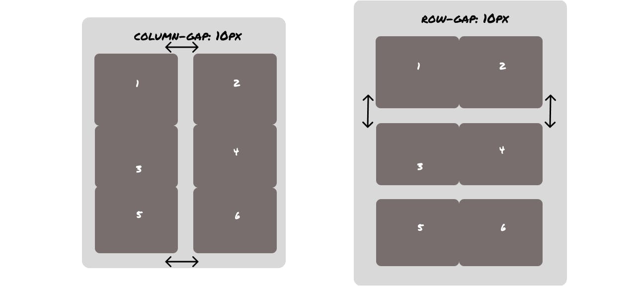
Grid gap
Grid gap as it sounds like creates gaps between the grid except around the edge of the grid container.
We can explicitly target the gaps between columns and rows too. Like these
For creating gaps between rows -
grid-row-gap-: 10px; and to create gaps between columns you have to use grid-column-gap: 10px; . You can create gaps in both of them with grid-gap: 10px 10px; where the first argument is for rows and the second is for columns. By the way, if both the values of arguments are same then you can use this grid-gap: 10px;.
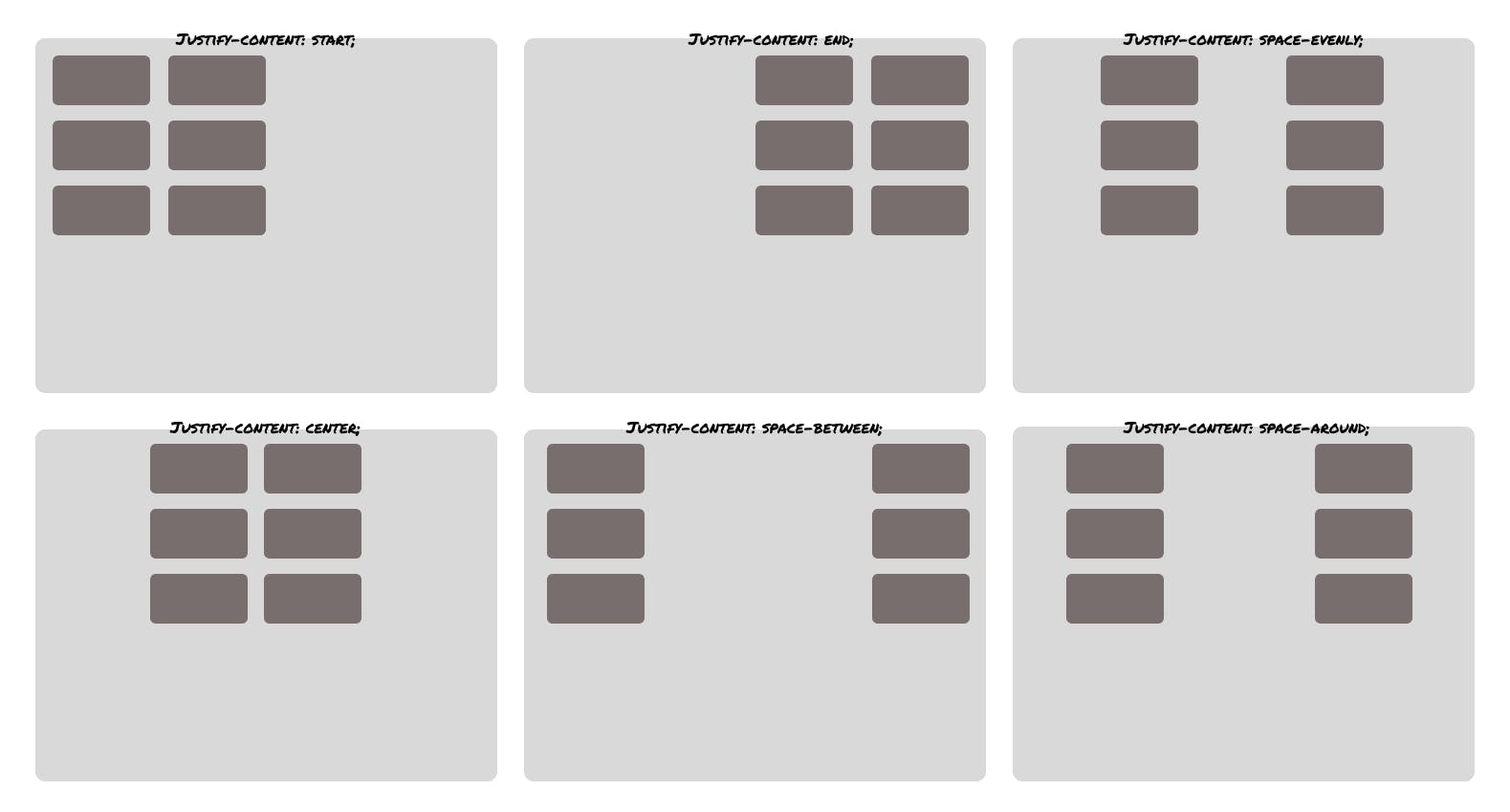
Aligning grid tracks with (justify & align-items)
Grid tracks can be aligned relative to the grid container along the row and column axis. So let's assume you have a container with 6 boxes in it and you want to align those in the centre or other direction. You can achieve that with different CSS properties like -
justify-content with these values centre, start, end , space-around and space-between on the x-axis with the following effects -
Another property is align-content for changing the alignment on the y-axis with these values centre, start, end , space-around and space-between which gives the following effects -

Aligning Grid Items
Aligning items inside the box
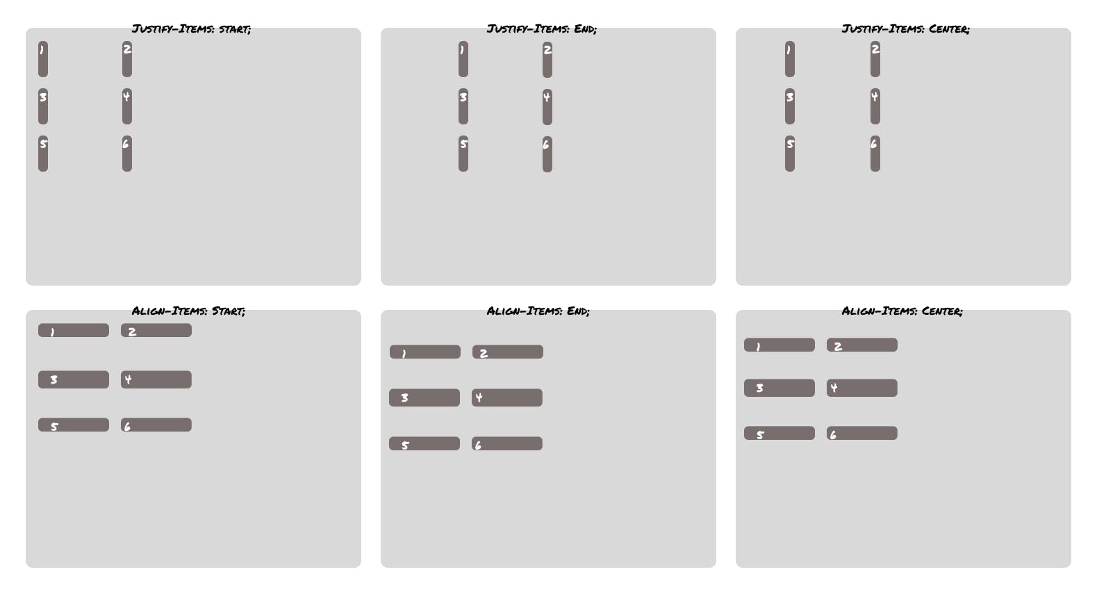
justify-items and align-items are applied to the grid container and support the following values:auto, normal, start, end, centre, stretch, baseline, first baseline and last baseline . The default value that both justify-items and align-items have is stretch with the following effects -
Individual items can be self-aligned with the align-self and justify-self properties. These properties support the following values - auto, normal, start, end, centre stretch, baseline, first baseline and last baseline with the following effects -
Spanning Items Across Rows and Columns
Spanning a grid over a column/row can be achieved with span keyword or changing the grid-column which is a shorthand whose first argument is for grid-column-start and the second is for grid-column-end and the same is for spanning over a row which only can be applied on the individual grid. Let's take an example for grid-column -
.grid1{
    grid-column: 2 span;
}
Output-

The same can be done with rows too.
.grid1{
    grid-row: span 2;
}
Output -

Layering grid items
.grid1{
    grid-column-start: 1;
    z-index: 2;
    grid-row-start: 1;
    grid-column-end: span 2;
    opacity: 0.5;
}
.grid2{
    grid-column-start: 2;
    grid-row-start: 1;
    background-color: #282121;
}
You can also create layers or stack grids on each other with z-index in proper places.

Grid-auto-flow
The default flow of the grid is grid-auto-flow: row; which looks like the following -

grid-auto-flow: column; will look like this -

P.S. - This is by no means a fully comprehensive guide on CSS grid layout. There are many things that I have not covered in this article. I only covered the most used ones that will help you on day to day basis. Following are some links for further deep study on the CSS grid.